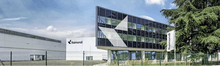
Raimondi Cranes, who has nearly 160 years of manufacturing history and business activity, has unveiled a new corporate identity and vision for the global construction audience. “We are delighted to present a new visual identity for Raimondi Cranes, one that builds on its long heritage within the global construction industry. For the past two years we have been working on reshaping our vision with heavy investments into a new manufacturing facility, and by allocating substantial resources to our R&D department,” said Eng. Diego Borgna, CEO, Raimondi Cranes.
The company has invested extensive resources into two core areas of business: a new production facility implementing lean-manufacturing innovative techniques, and the development of 14 new flat-tops that have been optimized according to customer feedback.
The overhaul of the company’s visual identity, a process that occurred over 16 months, represents a milestone for Raimondi as it is the company’s first full rebranding in decades. The new logo pays homage to Raimondi’s legacy by placing focus on one of its strongest design elements, the ‘R’ icon, while simplifying and modernizing it to signify efficiency and innovation. Raimondi’s signature shade of red has been replaced with a monochrome schema, conveying the company’s modernized approach. Touches of the heritage red will still be implemented on Raimondi’s products.